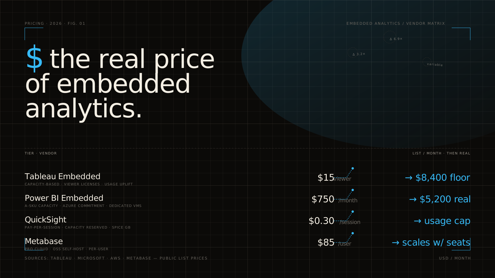
White label Power BI sounds simple at first. You picture a dashboard inside your app, your logo in the corner, maybe a few filters, done. Then the real questions show up: who signs the tokens, how tenants stay isolated, why exports still look like someone else’s product, and what happens to pricing when a pilot turns into 400 customer logins.
Why white-label Power BI turns into an architecture decision fast
Customer-facing analytics rarely stays in the “just embed the dashboard” phase for long. The second analytics becomes part of your product, not just a nice add-on, every shortcut starts to matter. Branding gaps feel cheap. Authentication flows get messy. Tenant isolation stops being a backend detail and becomes a trust issue.
That is why buying white label Power BI is not really about charts. It is about deciding how much of the analytics experience belongs inside your product surface, how much engineering work your team should own, and what tradeoffs you can live with six months after launch, not just during a demo.
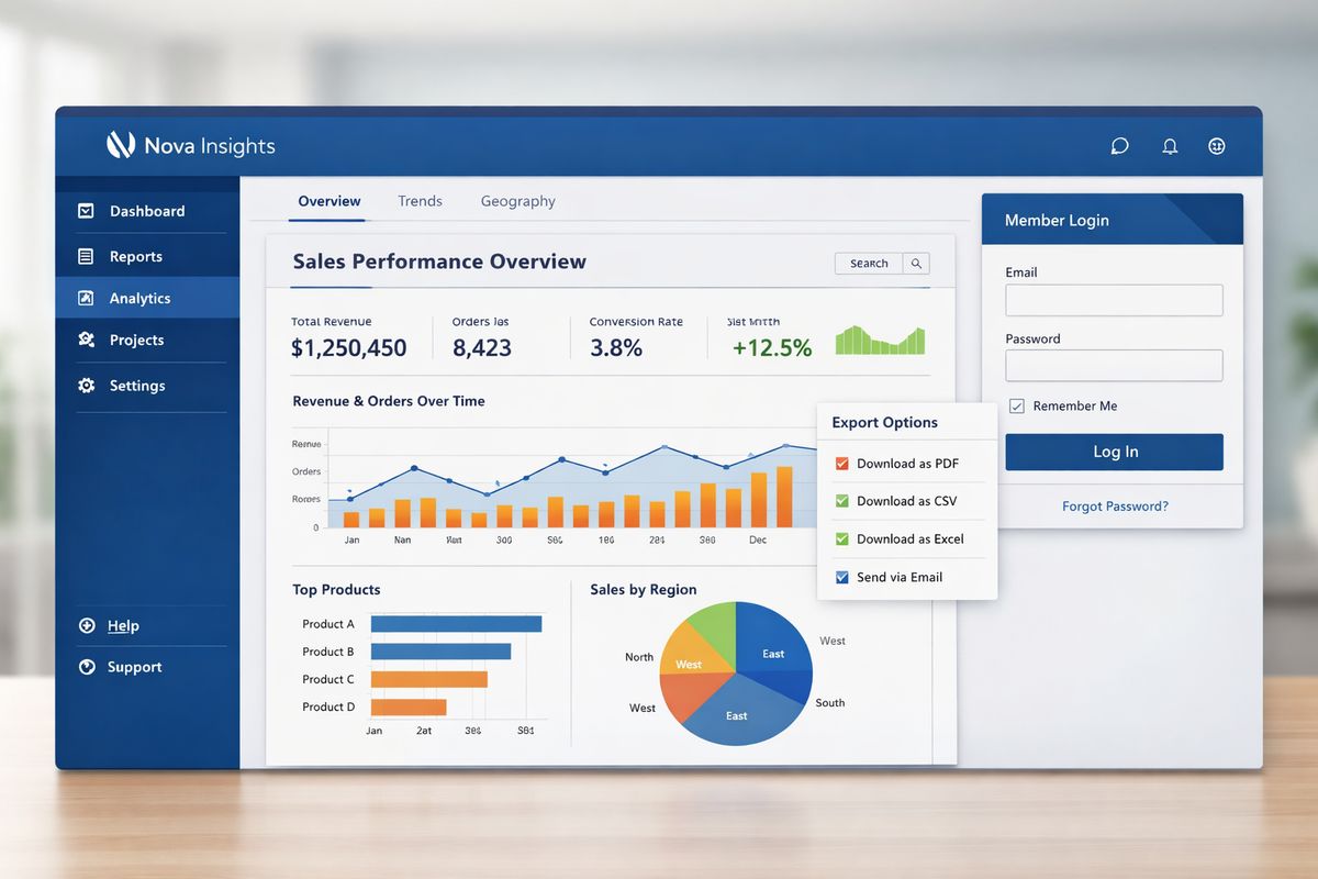
A lot of teams discover this in a very ordinary moment: a product review on a Tuesday afternoon, somebody clicks Export PDF, and suddenly the “native analytics experience” looks like a bolted-on BI tool. That moment tells you almost everything. If analytics is visible to customers, the embedding layer is part of your product architecture.
This guide gives you a practical checklist for evaluating that layer before you buy. Not a Power BI feature tour. A buying guide for branded, customer-facing analytics that has to work in production.
What “white-label Power BI” actually means in practice
In plain English, white-label Power BI means analytics that feels like part of your product instead of part of Microsoft’s. Your customers log in through your app, stay on your domain, see your navigation, and interact with reports that match your product’s look and behavior. Ideally, they never think about the vendor underneath.
That sounds obvious, but plenty of “white-label” claims stop at surface branding. A swapped logo is not the same as full ownership of the experience. A hidden toolbar is not the same as a native-feeling analytics layer.
The more useful definition is simple: white-labeling means the vendor disappears.
According to white label BI, the point is to rebrand and embed analytics so end users do not see the original platform identity at all. That is the bar worth using.
Embedded Power BI vs true white-label analytics
Basic embedding means you can place a Power BI report inside another application. Microsoft explicitly supports this through Power BI Embedded, and for some use cases that is enough. You get an interactive report in your application without forcing customers into the Power BI service directly.
But true white-label analytics asks for more. You need control over the shell around the report, the URL, the login flow, the menu structure, the way filters behave, and the way exports, alerts, and emails look when they leave the screen. You also need the analytics layer to behave like the rest of your product, not like an iframe living in a rented room.
That gap is where many buying decisions go sideways. A team evaluates reporting capability when the real requirement is product-grade presentation and control.
When Power BI is a strong fit and when it starts to fight you
Power BI is a strong fit when your stack already leans heavily into Microsoft, your data team already builds in Power BI, and your customer-facing requirement is fairly straightforward. If the goal is to expose a set of governed dashboards inside a portal with moderate branding and controlled access, Power BI can get you there faster than building from scratch. It also helps that Power BI connects to hundreds of prebuilt connectors, which reduces integration work in Microsoft-heavy environments.
It starts to fight you when analytics is a front-and-center product feature. SaaS apps with lots of tenants, agencies managing many branded client portals, and product teams that want tight UI control usually run into the same problem: Power BI can embed the report, but your team still has to solve the product experience around it.
Research from Toucan calls Power BI Embedded basic white-labeling for SaaS use cases, which matches what many teams notice in practice. If analytics is secondary, basic may be fine. If analytics helps close deals or retain accounts, basic starts to feel limiting fast.
Start with the buying question that matters most: buy, extend, or build
Before comparing vendors, decide what kind of problem you are solving. Are you buying Power BI Embedded directly and accepting its native limits? Are you extending it with a white-label platform on top? Or are you building the full embedding, auth, and portal experience yourself?
This is a product decision as much as an engineering one. If analytics changes how your users experience your product, the buying choice affects onboarding, support load, account expansion, and roadmap speed, not just implementation details.
Teams often frame this as “Can engineering make it work?” The better question is “What should engineering keep owning long term?” There is a big difference between integrating analytics and becoming the analytics platform team.
The real cost of building the embedding layer yourself
Building your own layer sounds attractive because it promises total control. The catch is that you are signing up for all the boring parts too: token services, tenant mapping, provisioning, retries, refresh issues, export handling, permission drift, frontend polish, admin tools, and support for every weird edge case that shows up after launch.
That effort is usually much larger than expected. Some sources estimate 6, 18 months to build customer-facing analytics in-house, and custom builds are often estimated around $150,000 to $360,000 over three years before ongoing maintenance. Separate implementation estimates for Power BI projects also stack up quickly, from $5K to $15K for one dashboard, $25K to $75K for a multi-dashboard suite, and far more for an org-wide platform.
Even if your team can do it, opportunity cost matters. Engineering time spent on tenant provisioning screens and embed token refresh logic is time not spent on core product features.
What you’re really paying for when you buy a white-label layer
When you buy a white-label layer, you are not paying for charts. Power BI already has charts. You are paying to avoid writing glue code over and over, to launch faster, and to reduce the pile of product work that sits between “report exists” and “customer-facing analytics actually feels done.”
That value usually shows up in four places: speed, consistency, supportability, and fewer late surprises. A good layer reduces how much custom auth work lands on your team, gives you clearer branding control, makes tenant setup repeatable, and lowers the odds that some forgotten surface, like a scheduled email or mobile view, leaks vendor identity.
If your team is actively comparing options beyond Microsoft’s native path, it helps to understand the broader criteria behind choosing a branded analytics layer. The same evaluation logic applies here: branding depth, embedding control, tenant safety, and scale economics.
Branding depth: the first thing to test, not the last
Most teams leave branding until the end because it sounds cosmetic. That is backwards. Branding depth is one of the fastest ways to tell whether a so-called white-label solution is genuinely product-ready or just embed-ready.
If the vendor cannot disappear cleanly, everything else gets harder to justify. Customers notice seams. Sales notices them too.
Custom domains, hidden vendor identity, and branded navigation
Start with the URL. If users bounce to a vendor domain for login, report access, or exports, the illusion breaks immediately. The same goes for any visible vendor name in navigation, help menus, footer text, browser titles, or shared links.
Your users should stay inside your product world from login to export. That includes custom domains, branded login screens, application navigation, report links, scheduled email links, and downloadable artifacts. If any of those surfaces still reveal the underlying platform, you do not have full white-labeling.
This matters more in external deployments than internal ones. An internal team may tolerate a vendor URL. A paying customer will read it as “this feature was outsourced.”
Theme control beyond colors and logos
Plenty of vendors say “fully branded” when they mean logo, accent color, and maybe a header image. That is not enough if analytics sits beside the rest of your product UI every day.
Real theme control includes fonts, spacing, panel behavior, control styling, dark mode support, layout decisions, embedded actions, and the ability to match your product’s design system. In practical terms, your analytics should not look like a Microsoft island inside your app.
One source recommends checking for control over fonts and dashboard domains rather than stopping at logos and colors. That is exactly the right instinct. Surface branding is easy. Consistent UI is the hard part.
Exports, alerts, emails, and edge-case surfaces
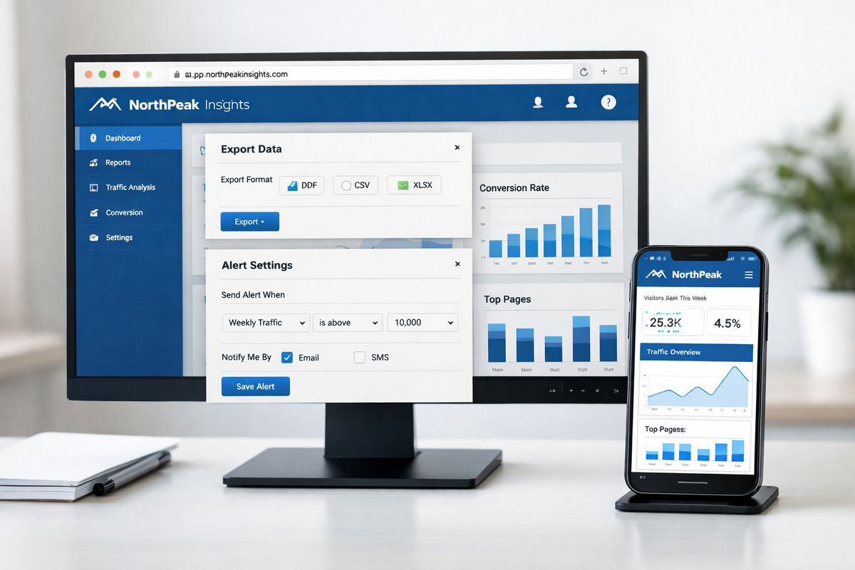
Here is where buyers routinely get burned: PDF exports, CSV downloads, scheduled reports, empty states, error messages, loading screens, and mobile layouts. These tiny moments break the illusion faster than the main dashboard because nobody remembers to test them until late.
Open the export. Check the email template. Look at a loading state on a phone. Trigger an auth timeout and see what message appears. If the product suddenly starts talking like a BI tool, your customers will notice.
Microsoft does offer security controls that can persist on data exported to Excel, PowerPoint, and PDF, which is useful. But security persistence is different from branding consistency. You need both.
Embedding method: iframe is easy, but the catch is in the product experience
Embedding method sounds technical, but it shows up as UX almost immediately. If analytics is tucked into a simple admin portal, iframe embedding may be perfectly acceptable. If analytics is central to the product experience, the embedding method becomes a real buying criterion.
What you can and can’t do with iframe embedding
Iframes are popular because they are fast to set up. You can get a report on screen quickly, and for many internal or low-touch use cases that is enough.
The downside is control. Iframes often make resizing awkward, complicate cross-domain behavior, and limit how deeply your app can react to what happens inside the report. Research describing Power BI Embedded as iframe-based also points out familiar issues like cross-domain cookie problems and responsive layout headaches.
That does not make iframes bad. It just means you should match them to the right job. For a simple portal, fine. For product-grade analytics with rich app interactions, not ideal.
Why SDKs and APIs matter for product teams
SDK and API driven embedding gives you more control over how analytics behaves inside your product. You can respond to events, sync filters with the rest of your application, control navigation, preserve state, influence drill paths, and make analytics feel like one more product module instead of a window into another tool.
That matters to product managers because it improves UX flexibility. It matters to engineering leaders because it reduces brittle workarounds. And it matters to data teams because the product can expose governed analytics without dumping raw BI complexity onto users.
If embedded analytics is a strategic feature, spend time on how product teams evaluate embedded BI. It helps clarify why “works on screen” and “fits the product” are not the same standard.
Authentication flow, JWT signing, and SSO support
This is the part nobody wants to discover late. Validate how tokens are generated, how long they last, how refresh works, how identities map into the analytics layer, and what happens when a user’s role changes mid-session.
If your stack uses SAML or OIDC, test that flow early. If your team expects service principals, delegated access, or customer identity federation, confirm the exact pattern. If JWT signing lands on your team, make sure that ownership is explicit and documented.
A polished demo can hide a lot of auth complexity. Production cannot.
Multi-tenant security is non-negotiable
https://www.youtube.com/watch?v=wFSrH88DEjc
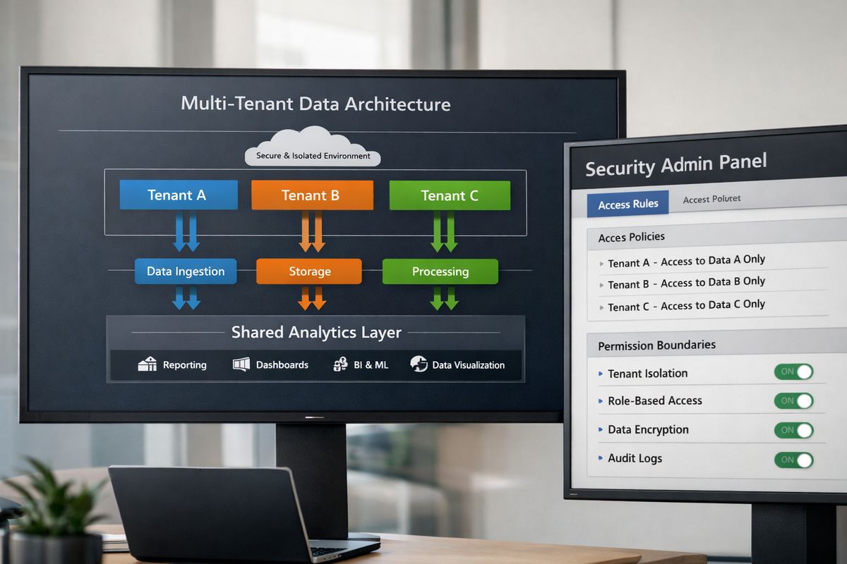
In customer-facing analytics, one tenant seeing another tenant’s data is not a minor bug. It is the kind of incident that can permanently damage trust. Nice dashboards do not matter if your isolation model is shaky.
That is why multi-tenant security should be treated as a hard requirement, not a feature checkbox.
Row-level security and tenant isolation models
Row-level security, or RLS, means users only see the rows they are allowed to see. In a shared dataset, that usually means tenant attributes are used to filter each user down to the right slice of data. It is a common and valid pattern, but it is not the only one.
You will usually choose between shared datasets with RLS, workspace-per-tenant setups, or deeper physical separation in storage or compute. Shared models can be efficient, but they need disciplined governance. Tenant-dedicated structures can simplify isolation logic, but increase overhead. Physical separation adds safety, but often raises operational complexity.
If your team needs a refresher on the implementation details, setting up tenant filters correctly in Power BI is worth reviewing before architecture decisions get locked in.
Shared capacity risks and noisy-neighbor problems
Security is not only about access. It is also about performance isolation. In shared capacity models, one customer running heavy queries can degrade the experience for everyone else on the same capacity.
That risk has been called out explicitly in analysis of Power BI alternatives, where shared-capacity throttling can hit all tenants unless you split workloads across capacities and route them carefully. In other words, one noisy tenant can turn into a product issue for every other account.
Do not test with one tenant and assume you are safe. Model burst concurrency across several tenants at once.
Audit logs, permissions, and admin controls
Internal platform teams and security reviewers will care about more than dashboard access. They need audit logs, admin visibility, role mapping, permission history, revoke flows, and evidence for compliance reviews.
A good buying process checks who changed access, who viewed what, how permissions are inherited, and how quickly access can be revoked. If those answers are fuzzy during evaluation, they will be painful during an audit.
Pricing can break the deal long after the demo
A lot of analytics pilots look affordable because the usage pattern is tiny and controlled. Production changes the math. More tenants, more viewers, more concurrency, more support, and more edge cases all show up at once.
Pricing model matters just as much as feature set.
Power BI Embedded, Fabric capacity, and the F64 threshold
Power BI Embedded uses Fabric capacity for embedded scenarios, which sounds straightforward until you hit the licensing thresholds. One of the biggest practical ones is the F64 line. On smaller F-SKUs, consumers typically still need Pro or PPU licenses to view content. At F64 and above, viewer economics change significantly.
That threshold matters because it can turn a reasonable pilot into a very different production budget. The F64 threshold is one of the first pricing issues to model if you expect broad external usage.
Per-user, per-view, and capacity-based pricing tradeoffs
Per-user pricing can work for internal analytics or a small, named audience. It usually hurts in B2B SaaS or agency scenarios where viewer counts are variable and customer-by-customer pricing needs to stay predictable.
Per-view pricing can look efficient until usage grows. Capacity-based pricing gives you more room to scale, but only if your concurrency and workload profile fit the capacity well. Otherwise you end up paying for performance management as much as report access.
This is where understanding embedded analytics cost models becomes useful. A platform that looks cheaper on day one can become the expensive option once usage spreads across tenants and roles.
Budgeting for implementation, not just licenses
License cost is only one line item. You also need to budget for data modeling, tenant provisioning, UX integration, monitoring, support workflows, semantic governance, and design polish.
Even modest Power BI delivery work adds up quickly. Industry estimates often place a single dashboard around $5K to $15K, a multi-dashboard suite around $25K to $75K, and a broader platform build far higher. If you are still comparing direct Power BI routes, it helps to map the likely jump in embedded Power BI costs at scale, not just the starter configuration.
Performance, scale, and refresh behavior matter more than a polished demo
A demo with one clean dataset proves almost nothing. Production analytics lives or dies on concurrency, query behavior, refresh timing, and observability.
Query performance and concurrency under real customer load
Ask how the system behaves when dozens of tenants hit dashboards during the same hour. Ask what happens when one customer runs heavy filters across a large model. Ask about cache strategy, import versus direct query patterns, and how the platform handles burst traffic.
If a vendor only shows one dashboard with one tenant, that is not performance testing. It is stage lighting.
Data freshness and refresh architecture
Data freshness is a product promise, even if nobody writes it down. If your dashboard says today, customers expect today. Import-based models can be fast, but refresh windows introduce lag. Live-query and Direct Lake patterns can reduce that lag, but they bring their own architecture considerations.
One cited example describes Direct Lake query times of under 800ms compared with a 30-minute import refresh cycle. The exact number matters less than the lesson: freshness architecture affects trust.
Monitoring and operational visibility
After launch, your team needs telemetry, error logs, usage analytics, capacity monitoring, and alerts when the embedded experience slows down or fails. Otherwise support becomes guesswork.
The boring operational stuff is what keeps analytics from turning into a constant stream of “dashboard is blank” tickets.
Self-service analytics: how much freedom should your users get?
Self-service is not automatically good. It is a product choice. The right amount gives customers useful freedom and lowers support load. Too much turns your product into a mini BI training program.
Filters, drill-down, and saved views
For most customer-facing analytics, the sweet spot is controlled self-service: filters, drill-down, date controls, segmentation, and saved views. Those features help users answer common questions without opening a support ticket.
The trick is to give freedom around exploration, not around definition. Let users slice data. Do not let every screen define the business differently.
Ad hoc reporting and governed exploration
Ad hoc reporting can be powerful if it sits on top of governed dimensions, measures, and permission boundaries. Without that foundation, it creates metric drift, confusion, and endless “why doesn’t this match the dashboard?” complaints.
Safe exploration is not the same as open-ended report building. One is a product feature. The other can become a governance mess.
AI-assisted analytics without unsafe SQL roulette
AI is now part of the buying conversation, but not all AI analytics is equally safe. The best implementations ground natural-language answers in a semantic model, so the system uses governed definitions instead of inventing raw SQL on the fly.
That matters for consistency, auditability, and multi-tenant safety. An AI feature that can generate unpredictable queries across tenant boundaries is not a feature. It is a risk surface.
Semantic layer and metric governance: the part that saves support tickets later
Once analytics is customer-facing, metric consistency becomes a product requirement. If “active customer” means one thing on the overview page and another thing in an export, support tickets are guaranteed.
Shared metric definitions across dashboards and AI
Use a governed semantic layer so key metrics are defined once and reused everywhere. ARR, utilization, active customer, renewal risk, whatever matters in your business, it should not be re-created report by report.
That same layer should also guide AI answers and self-service exploration. Otherwise your dashboards and your natural-language analytics will slowly drift apart.
Versioning, testing, and change management
Ask how models and reports move from dev to staging to production. Ask how rollbacks work. Ask what happens if you change a field name used by embedded reports. Ask whether your team can test changes without breaking the live customer experience.
Analytics changes often feel small until they break something public. Good versioning and promotion workflows save you from unnecessary drama.
Questions to ask vendors before you sign anything
A good demo makes everything look smooth. A good buying process makes vendors answer the awkward questions too.
Questions about branding and embedding
Ask what parts of the UI cannot be white-labeled. Ask whether custom domains are supported for every user-facing surface. Ask if embedding is iframe-only or if there is an SDK with event APIs. Ask how much control you have over styling, navigation, exports, and mobile behavior. Ask what vendor marks, if any, remain visible.
If the answers are vague, assume the seams are real.
Questions about security and identity
Ask how tenant isolation is implemented and tested. Ask whether RLS is shared-model only or whether stronger separation patterns are supported. Ask how JWT generation works, how SSO is handled, which identity providers are supported, and what audit logs are available. Ask what admin roles exist and how quickly access can be revoked.
Security answers should sound specific, not reassuring.
Questions about scale and pricing
Ask about concurrency limits, noisy-neighbor protection, capacity planning, and how pricing changes when usage grows. Ask what happens at licensing thresholds, especially around Fabric capacity. Ask whether one tenant can affect another tenant’s performance and what the mitigation path looks like.
Demos rarely show the part that gets expensive.
Common mistakes buyers make with white-label Power BI
The most common mistake is choosing based on dashboard polish. A polished chart does not tell you anything about auth complexity, export branding, or multi-tenant safety.
Another common mistake is underestimating licensing. Power BI economics can shift a lot between pilot and production, especially when external viewer counts grow or capacity thresholds come into play.
A third mistake is treating RLS like a checkbox. RLS is part of a broader tenant isolation model, not a magic answer by itself. If provisioning, role mapping, testing, and auditability are weak, the whole setup is weak.
And then there are the surfaces people forget: email reports, mobile layouts, empty states, export files, admin screens. Those details are where “white-label” claims often fall apart.
Best-fit recommendations by use case
The right choice depends on what role analytics plays in your environment. Same tool category, very different priorities.
For B2B SaaS products shipping customer-facing analytics
If analytics helps sell, retain, or expand accounts, prioritize SDK control, strong tenant isolation, predictable scale pricing, and self-service features that stay inside governed boundaries. Vendor exposure should be close to zero. Product fit matters more than quick setup.
For agencies and analytics consultancies managing many client portals
Prioritize fast tenant provisioning, reusable report templates, client-safe branding, and pricing that works across many lower-volume accounts. Agency work often lives or dies on repeatability. A small amount of friction multiplied by 40 clients turns into a real operations problem.
For internal data platform teams unifying dashboards across tools
Focus on SSO, governance, portal integration, and the ability to present multiple BI sources behind one consistent branded layer. In this scenario, white-labeling is often less about hiding a vendor from customers and more about giving internal users one clean front door.
A short pre-buy checklist you can run this week
Keep the first pass simple. Shortlist two or three options. Test custom domain support early. Run one real SSO flow instead of accepting a slide. Model one multi-tenant scenario with actual roles and edge cases. Price the move from pilot to broader rollout, not just the first month.
Then do one thing that catches more problems than almost anything else: recreate a customer journey from login to export on a mobile screen. If the seams show there, they will show everywhere.
Frequently Asked Questions
Can Power BI be fully white-labeled?
Power BI can be embedded and branded to a point, but “fully white-labeled” depends on how much control you need over domain, UI, navigation, exports, emails, and auth flow. For simple embedded reporting, it may be enough. For product-grade analytics with deep branding control, you need to test the edge surfaces carefully.
Is Power BI Embedded enough for a SaaS product?
It can be, especially if your product already relies on Microsoft tooling and analytics is a secondary feature. If analytics is central to your product experience, you will probably care more about SDK control, tenant isolation patterns, and scale economics than a basic embed project can comfortably provide.
How does row-level security fit into white-label Power BI?
RLS is one of the main ways to make shared datasets safe for multiple customers. It filters data so users only see the rows assigned to them. That said, RLS is only one part of tenant isolation. Provisioning, identity mapping, testing, and audit logging matter just as much.
Why does the F64 threshold matter so much?
Because it changes viewer licensing economics in a very practical way. Below F64, external consumer access often still brings Pro or PPU licensing requirements. At F64 and above, viewing rules change, which can make production costs look very different from a pilot.
Are iframes always a bad choice for embedded analytics?
No. Iframes are often fine for simple portals or lower-touch reporting experiences. The issue is not that iframes are wrong, it is that they limit UX flexibility, event handling, and responsive behavior when analytics becomes a core product feature.
What should you test before signing a contract?
Test custom domain behavior, SSO flow, tenant isolation under realistic roles, export and email branding, mobile rendering, and pricing at a larger usage tier. A vendor that looks great in a demo can still create expensive surprises once real customers start clicking around.