Embedded BI is dashboards, reports, and data exploration built directly into the software your users already use. If you’ve ever watched a customer click away from your product into a separate BI portal, wait for another login, then ask support why the numbers do not match, you already know why embedded bi matters. The short version: it keeps analytics in context, shortens the path from question to action, and saves you from building an entire delivery layer just to show a chart.
What Embedded BI Is
Embedded BI means your analytics live inside the product, portal, or operational app where work already happens. Instead of sending someone to a standalone reporting tool, you place the dashboard next to the workflow itself: inside a customer account page, inside a support console, inside a client portal, inside an ERP screen.
That distinction matters more than it sounds. A chart is not embedded just because it exists somewhere on the internet. Embedded BI is about delivery in context. Your users stay in the same branded experience, under the same identity model, with the same navigation and permissions, and get answers without taking a detour.
For B2B SaaS teams, this often shows up as customer-facing reporting. For agencies and consultancies, it is usually a branded portal where clients can see campaign, revenue, or operations data. For internal platform teams, it can mean one portal that pulls analytics from several tools so users stop bouncing between vendor-specific dashboards.
Embedded BI vs. Embedded Analytics vs. Traditional BI
These terms get mixed together constantly, so here’s the simple version.
Embedded BI usually refers to classic business intelligence capabilities placed inside another product: dashboards, reports, filters, drill-down, self-service exploration, exports. Embedded analytics is a broader umbrella. It includes BI, but can also include alerts, AI summaries, anomaly detection, recommendations, and workflow actions tied to the data.
Traditional BI sits off to the side. Users open a separate environment, often with a different URL, different permissions, and a different mental mode. That model still works for analysts and power users. It does not work nearly as well for busy account managers, customer success teams, external customers, or operations staff who need one answer in the middle of a task.
If you want a cleaner mental model, think of BI as the library and embedded BI as the reference shelf built into your workspace. Same knowledge, different delivery.
A Simple Example of Embedded BI in Action
Picture a customer success manager logging into your SaaS platform at 9:07 a.m. A renewal call starts at 9:30. On the account page, a customer health dashboard is already there: product usage for the last 30 days, open support issues, onboarding milestones, contract value, and churn risk.
No export. No extra tab. No “hold on, let me pull that from Tableau.”
The manager clicks a dip in weekly usage, filters by team, notices adoption fell after an admin left, and opens a workflow to schedule training. That is embedded BI doing its job. The analytics are not a separate destination. They are part of the job itself.

Why Teams Use Embedded BI
Teams use embedded BI because standalone reporting keeps failing the same test: people do not want to leave the application just to answer one question. Analytics has become a product feature, not a sidecar.
The broader market is moving in that direction fast. Research suggests more than 60% of new business apps will include embedded analytics by 2027. That sounds like a trend report line, but it reflects a plain reality: users now expect reporting inside the product, not bolted onto it later.
It Cuts Context Switching
Context switching is expensive in ways teams often underestimate. A user leaves your app, authenticates somewhere else, reorients to a different UI, finds the right report, then tries to connect that report back to the task at hand. Even when each step only takes a minute, the momentum is gone.
Embedded BI removes that friction. The usage graph lives beside the customer record. The inventory trend sits inside the ERP workflow. The SLA dashboard appears next to open cases. Answers arrive where decisions happen, which is exactly why embedded analytics tends to feel faster even when the data itself has not changed.
The catch is that users judge analytics by flow, not by architecture. If the insight appears at the right moment, it gets used. If it requires a detour, adoption drops.
It Improves Adoption of Data
Most companies have more data than actual data usage. BARC found that only 25% of employees actively use BI and analytics tools on average. That gap explains a lot. The problem usually is not lack of dashboards. It is lack of relevance at the moment work happens.
Embedded BI helps close that gap by turning occasional users into what BARC calls just-in-time analysts. Someone does not need to “be into BI” to benefit from seeing renewal risk, margin trend, or campaign performance inside the screen already open.
That is why adoption often rises when analytics move into the workflow. Not because the charts get prettier, but because the effort required to use them drops sharply. If you’re building in-app reporting for a SaaS product, this is usually the whole point.
It Can Support Retention, Expansion, and New Revenue
Analytics can make your product stickier. When customers rely on your application not just to do work, but to understand work, switching gets harder. A customer who checks usage trends, account performance, and operational metrics inside your product is more tied into it than a customer exporting CSVs every Friday.
There is a commercial angle, too. Embedded reporting often becomes part of a premium plan, an enterprise add-on, or a differentiator in crowded SaaS categories. Agencies use it to deliver better client portals. Consultancies use it to show value continuously rather than in monthly slide decks. Platforms with strong in-app reporting have even been associated with stronger retention and upsell outcomes in market research.
None of this works if the analytics are confusing or untrusted. But when done well, embedded BI stops being “that reporting feature” and becomes part of the value customers pay for.
Where Embedded BI Shows Up
Embedded BI is easiest to understand once you stop thinking of it as a BI category and start thinking of it as a delivery pattern.
Customer-Facing SaaS Applications
This is the most common use case. Your customers log into your product and see dashboards, reports, and filters that explain what is happening in their account. A marketing platform shows campaign ROI. A logistics app shows delivery performance. A security platform shows risk trends. A billing product shows spend by team.
Good customer-facing analytics do not feel stapled on. The dashboard respects your navigation, your branding, your permission model, and your product language. It feels native because, from the user’s point of view, it is.
Client Portals and Agency Reporting Hubs
Agencies, consultancies, and service firms often need one branded place where clients can see performance across multiple data sources. That usually means advertising data, CRM data, finance data, operations data, or a mix of vendor dashboards all presented in one portal.
This is where embedded BI gets especially practical. Instead of teaching every client a different BI tool, you give them one portal, one login, one set of reports, and one visual language. If your use case leans heavily on branding and client experience, it helps to look closely at what actually matters in a branded analytics layer.
Internal Portals and Operational Apps
Embedded BI is not only for external customers. Internal support hubs, partner portals, field service apps, ERPs, CRMs, and operations consoles all benefit from in-context analytics. A warehouse manager needs fulfillment exceptions inside the operations screen. A support lead needs backlog and SLA trends beside ticket queues. A partner manager needs revenue and pipeline metrics inside the portal used every day.
Research shows 76% of organizations already use embedded analytics internally, which makes sense. Internal users are often the first group to benefit because their workflows are repeatable and the value of faster decisions is obvious.
How Embedded BI Works Under the Hood
From the outside, embedded BI looks simple: a dashboard appears inside your app. Under the hood, a lot has to go right for that experience to be secure, fast, and maintainable.
The Core Building Blocks
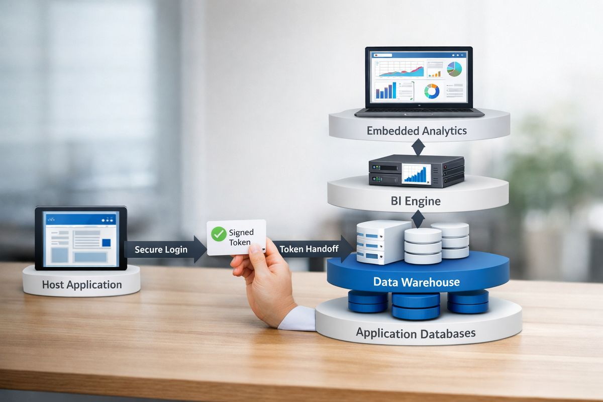
Most embedded BI setups include the same basic layers. First, your source systems: application databases, product event streams, CRM data, billing data, support data, warehouse data. Then a warehouse, lakehouse, or semantic layer where metrics get modeled and standardized. After that comes a BI engine or analytics layer that handles querying, caching, rendering, and interaction. Finally, you have the embedded frontend inside your product, plus identity and security controls that decide who can see what.
If you want a mental picture, think of a restaurant pass window. The kitchen is your data layer, the plating station is the BI engine, and the pass window is the embedded delivery layer. Customers only see the final plate, but if the kitchen tickets are wrong or the pass gets backed up, service falls apart.
Common Embedding Methods
The quickest approach is usually an iFrame. You drop a BI experience into your application with a URL and some access controls. This can be enough for simple rollouts or prototypes, and it gets something in front of users fast.
But speed comes with tradeoffs. iFrames can create UX seams, limited interaction with the host app, and trickier styling. JavaScript SDKs and APIs usually give you much more control. You can pass filters from the host application, trigger events, customize navigation, and make the analytics feel more native. Tighter native integrations take more setup, but they typically win on polish and long-term maintainability.
A rough rule helps here: iFrames are great for proving demand, not always for delivering the final product experience.
Authentication, SSO, and JWT Signing
Authentication is where embedded BI stops being a design exercise and becomes real engineering work.
Your host application already knows who the user is. The embedded analytics layer needs to know that too, without forcing another awkward login. That is where SSO, or single sign-on, comes in. SSO lets a user authenticate once and carry that identity into connected systems.
JWT signing often sits in the middle of that handoff. A JWT, short for JSON Web Token, is a signed package of claims about the user, such as identity, role, tenant, or allowed scope. Your application creates the token, signs it, and passes it to the embedded layer. The analytics system verifies the signature and trusts the session because the host application vouched for it.
Done well, this feels invisible to the user. Done poorly, it creates broken sessions, access leaks, and support tickets nobody enjoys.
Row-Level Security and Tenant Isolation
Row-level security, or RLS, means each user only sees the rows of data allowed for that person, team, or customer account. In multi-tenant SaaS, this is not a feature request. It is table stakes.
If tenant A can ever see tenant B’s records, even by mistake, your problem is no longer “dashboard implementation.” It is incident response.
That is why permission mapping and tenant isolation need to be designed early. Filters in the UI are not enough. Security has to exist in the query path, the semantic model, or the serving layer, with clear logic tied to your application identity. If you are evaluating vendor-specific approaches, it helps to understand how tenant boundaries are usually enforced and where platform-specific RLS setups can get tricky, especially in Power BI deployments with role mapping.
What Good Embedded BI Usually Includes
Once the plumbing is in place, the question becomes simpler: what do users actually expect?
Dashboards, Reports, and Drill-Down
The foundation is still the foundation. Users want KPI dashboards, interactive reports, filters, date controls, drill-down paths, and cross-filtering between charts. That may not sound glamorous, but these features carry most of the day-to-day value.
A good dashboard answers the first question quickly, then makes the next question easy. Revenue dropped. Which segment? Which account? Which week? Which team? That progressive reveal is what turns a static chart into a useful working surface.
Self-Service Exploration
Users do not want to file a ticket every time they need a different date range or breakdown. Good embedded BI lets people adjust filters, swap dimensions, compare periods, and explore follow-up questions without opening a backlog item for the data team.
But flexibility needs guardrails. If every user can define revenue differently, “self-service” turns into chaos fast. The best setups offer freedom inside trusted boundaries: governed metrics, approved dimensions, clear labels, and sensible defaults.
Research points in the same direction. Self-service BI in applications is now one of the largest embedded analytics segments, but it works only when the foundation is clean.
White-Labeling and UX Fit
If the embedded experience looks like a foreign body inside your app, users notice immediately. Fonts change. Navigation disappears. Colors feel off. Mobile layouts break. The whole thing screams “another tool.”
White-labeling fixes that, at least when done properly. Themes, logos, spacing, navigation patterns, responsive behavior, and accessibility settings should all fit your product. The goal is not vanity. It is trust. A familiar interface lowers friction and makes analytics feel like part of the product rather than a rented room in somebody else’s building.
Alerts, Sharing, and Collaboration
Analytics gets more useful when it can leave the dashboard at the right moment. Subscriptions, threshold alerts, exports, scheduled emails, annotations, and shareable links all help people act on information instead of just viewing it.
That said, more collaboration features do not always mean better outcomes. A noisy alerting setup can become background static in a week. The trick is to tie alerts and sharing to meaningful events: spend anomalies, usage drops, SLA breaches, inventory risks, renewals at risk.
AI and Natural-Language Features
AI is showing up everywhere in embedded BI: natural-language queries, plain-English summaries, anomaly detection, suggested insights, automated explanations. Some of it is genuinely useful. Some of it is glitter on top of shaky metrics.
Market momentum is real. Gartner has projected that over 80% of software vendors will ship embedded GenAI capabilities in products by 2026. But AI only helps when your data definitions are trusted and the output maps cleanly to the job your users are trying to do.
If your “active customer” metric changes between screens, an AI summary just explains the wrong number more confidently.
Embedded BI vs. Building It Yourself
This is the decision sitting behind most evaluations: buy an embedded BI layer, or build the whole thing in-house.
Here is the blunt version. Building charts is not the hard part. Building the secure, scalable, governable embedding layer is.
What “Build” Really Means
A custom build sounds smaller on a whiteboard than it is in production. You are not just rendering charts. You are owning auth flows, SSO, signed tokens, session handling, permissions, tenant isolation, reusable filters, export services, caching, audit logs, version control for content, observability, performance tuning, and support tooling.
Then come the unglamorous parts: retry logic, stale cache bugs, broken drill paths, browser quirks, accessibility fixes, mobile layouts, and “why did this customer receive the wrong scheduled report?” incidents.
That is the iceberg. Most internal build estimates cover the visible tip.
When Buying an Embedded BI Layer Makes Sense
Buying usually makes sense when time to market matters, frontend bandwidth is limited, multi-tenant security is a real requirement, or your team wants one branded analytics surface over several BI tools. It also makes sense when analytics are valuable but not your core product moat.
Research for ISVs suggests teams with fewer than 20 dedicated BI engineers often benefit from buying because prebuilt multi-tenancy, RLS, and white-labeling can take 12 to 18 months to recreate well. That timeline feels about right because the hard part is not “showing a dashboard.” It is making the entire system dependable.
When a Custom Build Can Still Be Worth It
A custom build can be worth it when your product requires unusual interactions that standard BI layers do not handle well, such as domain-specific visualizations, tight workflow actions, custom investigative experiences, or highly constrained UX patterns. It can also make sense if your team already owns a mature semantic layer, identity system, and internal embedding framework.
Even then, custom is worth it only if analytics are strategic enough to justify ongoing ownership. Not just launch effort, ongoing ownership.
The Main Benefits You Can Expect
Once embedded BI is implemented well, the upside is pretty straightforward.
Faster Time to Market
Using an embedded BI layer means you ship sooner. You are not starting from zero on auth handoff, permissions, rendering, subscriptions, exports, and white-label mechanics. That compression matters because analytics roadmaps tend to expand the moment customers see the first dashboard.
Faster launch also gives you faster feedback. You learn what users actually open, which metrics cause confusion, and what deserves deeper investment.
Better User Experience
A smooth in-app reporting experience feels less like a reporting chore and more like part of getting the job done. That difference is not cosmetic. It changes usage.
Users do not care that the chart came from a separate analytics engine. They care that it loaded quickly, matched the rest of the application, and answered the question without friction.
More Productive Teams
Embedded BI reduces manual exports, repeated ad hoc requests, and custom reporting fire drills. Your data team spends less time rebuilding the same view for different audiences. Your engineering team spends less time maintaining one-off dashboard plumbing. Your business users spend less time hunting for numbers.
That productivity effect shows up in survey data too. Reveal found 62% of organizations say embedded analytics or BI contributes to productivity gains.
Stronger Product Value
In many SaaS categories, dashboards are no longer a nice extra. They are expected. If your competitors show customers usage trends, outcomes, and benchmarks inside the product while you still rely on exports and emailed reports, the gap feels bigger than “missing analytics.” Your product feels less complete.
Embedded BI helps close that gap, and in strong implementations, turns analytics into one of the reasons customers stay.

The Biggest Challenges and What Usually Goes Wrong
The benefits are real. So are the failure modes.
Weak Data Quality and Metric Drift
The fastest way to kill trust in embedded BI is to put polished dashboards on top of inconsistent definitions. If revenue is one number in the customer portal, another in finance, and a third in the internal admin screen, users stop believing all of it.
Trust drops fast and recovers slowly. Research from BARC keeps landing on the same point: data quality and governance are foundational, not cleanup work for later.
Governance That Arrives Too Late
A lot of teams get excited about self-service, then realize nobody agreed on what the metrics mean or who owns them. That is backward.
Governance should arrive before wide rollout. Metric definitions, role-based access, audit trails, source ownership, naming standards, and approval paths need to exist early. There is a reason research keeps warning not to launch self-service before governance. A flashy interface cannot compensate for missing control.
Performance, Scale, and Cost Surprises
An embedded dashboard that works for 20 customers can break badly when 2,000 users hit it on Monday morning. Concurrency, caching, query design, pre-aggregation, and session patterns suddenly matter a lot.
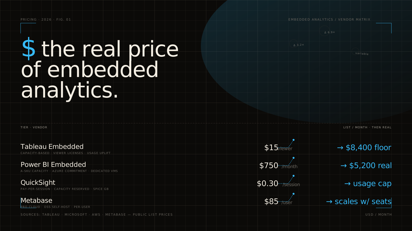
Cost can surprise you too. Per-user, per-session, or usage-based pricing may look fine in a pilot and very different at scale. If you’re comparing vendors, spend time on how pricing behaves once usage grows, not just the demo environment.
Overbuilding the Analytics Surface
This one is common. Teams add too many dashboards, too many filters, too many tabs, and now too many AI widgets. The result feels impressive in a product review and exhausting in actual use.
Most users do not want “all the analytics.” They want the right 3 answers in the right place. Relevance beats volume every time.
How to Evaluate an Embedded BI Solution
A good evaluation starts with the job the analytics needs to do, not the demo chart gallery.
Start With the User Workflow, Not the Chart Type
The right first question is not “Does it support waterfall charts?” It is “Where does the insight need to appear, and what action follows?” If a customer success manager needs account health before a renewal call, evaluate the login flow, page load, permission handoff, and drill path to the action.
That keeps you from buying a beautiful analytics product that does not fit your actual product workflow.
Check Security and Governance Early
Security requirements belong on day one, not in legal review two weeks before launch. SSO, JWT or equivalent secure token support, RLS, tenant isolation, auditability, and permission mapping should all be evaluated early.
If a vendor demo skips this part, that is a signal.
Review Developer Experience
Developer experience matters because embedded BI lives or dies in implementation details. Look closely at SDK quality, API coverage, documentation depth, sample apps, sandbox environments, release versioning, and how much custom frontend work is still required to get the UX you want.
A feature list can look perfect and still create weeks of avoidable engineering pain.
Understand Data Model and BI Tool Compatibility
Compatibility matters more than flashy front-end features. Can the solution work with your warehouse, semantic layer, dbt models, and existing BI stack? Can it unify dashboards from multiple sources into one portal if that is your goal? Can it preserve governance across those sources?
This becomes especially important when your organization already has Power BI, Tableau, Looker, or mixed tooling in place.
Ask About Pricing at Scale
Always model pricing against real usage patterns: number of tenants, viewers, embedded sessions, exports, alerts, and peak concurrency. Pilots rarely reveal the full cost shape.
What looks cheap for one customer success team may become expensive across 800 customer tenants.
A Practical Rollout Plan
The lowest-drama rollout is usually the best one.
Start With One High-Value Use Case
Pick a use case where the value is already obvious: account health, usage reporting, client campaign performance, support SLA tracking, or finance visibility for customers. Start narrow, prove adoption, then expand.
This does two useful things. It limits implementation complexity, and it gives you a clean before-and-after comparison.
Design the Permission Model Before Launch
Do not patch access rules after the first security scare. Define tenant boundaries, role mapping, admin behaviors, impersonation rules, and export permissions before dashboards go live.
Permission design feels tedious right up until the moment it saves you.
Build Reusable Metrics and Components
Reusable metric definitions, shared filters, standardized KPI logic, common drill paths, and consistent UI patterns keep each new dashboard from becoming a fresh project. This is where embedded BI starts to scale instead of sprawl.
Research and practice both point to the same pattern: start with power users, then build reusable structures others can inherit.
Measure Adoption and Support Load
Track who opens dashboards, which reports get used, what actions follow, how long it takes to answer common questions, and how many support tickets the analytics create or eliminate. Usage without outcomes can be misleading. Support load without context can be misleading too.
The point is to learn whether embedded BI is actually reducing friction in the workflow it was meant to improve.
Common Questions About Embedded BI
Is Embedded BI the Same as Embedded Analytics?
Not exactly. Embedded BI usually refers to dashboards, reports, and self-service analysis inside another application. Embedded analytics is broader and can include BI plus alerts, AI summaries, anomaly detection, and workflow actions. In practice, plenty of teams use the terms interchangeably.
Is an iFrame Enough for Embedded BI?
Sometimes. An iFrame is often enough for a fast proof of concept or a simple internal use case. But if you need tight branding, deep interaction with the host app, advanced permission handoff, or a polished enterprise UX, an iFrame alone is usually not enough.
Can Embedded BI Work With Existing BI Tools?
Yes, often. Many teams use an embedded layer to present dashboards from existing BI tools inside one branded portal. The hard parts are identity, security, UX consistency, and governance. If those are handled cleanly, consolidation works surprisingly well.
Is Embedded BI Secure for Enterprise Use?
Yes, if the implementation is disciplined. Strong identity controls, signed tokens, row-level security, auditability, tenant isolation, and clear permission mapping are what make it enterprise-ready. Secure embedded BI is absolutely possible. Casual embedded BI is where problems start.
What Should You Try First?
Map one customer-facing reporting workflow from login to dashboard to action. Be specific. Which user logs in, what screen opens, what metric matters, what filter gets used, what action happens next, and what permissions control the whole path.
That one exercise usually makes the buy-versus-build decision much clearer. It shows where embedded BI will create real value, and where your real work is waiting.