

A slow embedded report makes your whole product feel shaky. The spinner hangs, the frame sits blank, and suddenly your app looks broken even when the data is perfectly fine. Power BI performance optimization is the work of making embedded reports load faster, respond faster, and stay fast under real usage, and the trick is simple: stop blaming DAX for everything.
You can fix most embedded report speed problems once you split the system into parts and tune each one on purpose. In this guide, you’ll sort out where the lag actually lives, clean up the model, shape data more intelligently, choose the right storage mode, trim report bloat, and tighten the embedding layer so the report feels like part of your app instead of a slow guest inside it.
What you’ll learn:
- How to triage slow embedded reports
- Which tools actually help diagnose performance
- Why model shape matters more than clever visuals
- When Import beats DirectQuery
- DAX fixes that pay off quickly
- Embedded-specific wins like preload and bootstrap
- How to monitor performance after launch
Why Embedded Power BI Reports Feel Slow in the First Place
You’ve probably seen this exact scene: the page around the report loads quickly, but the embedded report keeps thinking. Users don’t separate your app from the report. If the report is slow, your app is slow. That’s the reality.
Here’s the thing: embedded performance is a full-stack problem. The source query might be slow. The semantic model might be bloated. The page might have 18 visuals all cross-filtering each other. Your app might be loading scripts late, waiting for a token, then creating the iframe only after everything else is done. Any one of those can hurt. A few of them together can turn a decent report into a frustrating one.
Microsoft’s guidance is clear that report load time mostly depends on report and data factors, especially visuals, data volume, and query complexity. But embedded scenarios add one more layer: the code path that gets the report onto the page. That matters more than a lot of teams expect.
Most performance issues are fixable. Not all are tiny fixes, but most are understandable once you stop treating the report like a black box.
Start With a Simple Performance Triage
Before changing measures, relationships, or SDK settings, figure out what kind of slow you actually have. “The report is slow” is too vague to be useful.
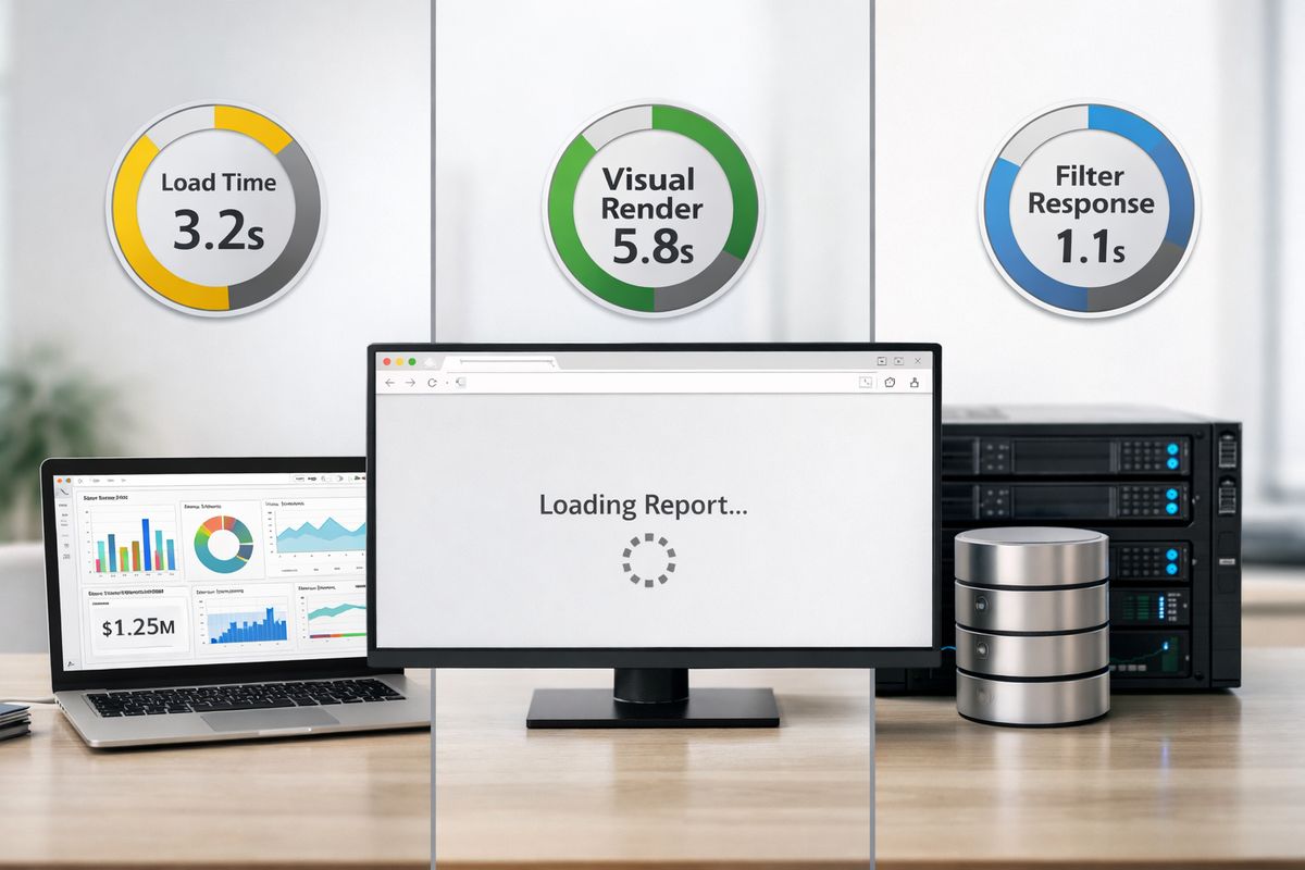
Initial load time is one problem. A page that opens in 12 seconds has a different issue than a page that opens in 3 seconds but takes 6 more seconds to draw a matrix. Filter response time is different again. And if users are complaining about stale data, that may be a refresh pipeline issue, not a report interaction problem.
Once you separate those, your work gets easier fast.
Split the Problem Into Four Layers
Start by looking at four layers: source, model, report page, and embedding behavior.
Source performance is about the system behind Power BI. Slow SQL, badly indexed tables, expensive joins, or long gateway hops can make every interaction crawl. If you’re using DirectQuery, this layer becomes impossible to ignore.
Model design is the semantic layer inside Power BI. That includes relationships, table shape, column cardinality, storage mode, and measure logic. A messy model creates slow queries even when the source is fine.
Report page complexity is the stuff users actually see: visuals, slicers, bookmarks, custom visuals, cross-highlighting, tooltips, and interactions. Every visual is work. Every interaction is more work.
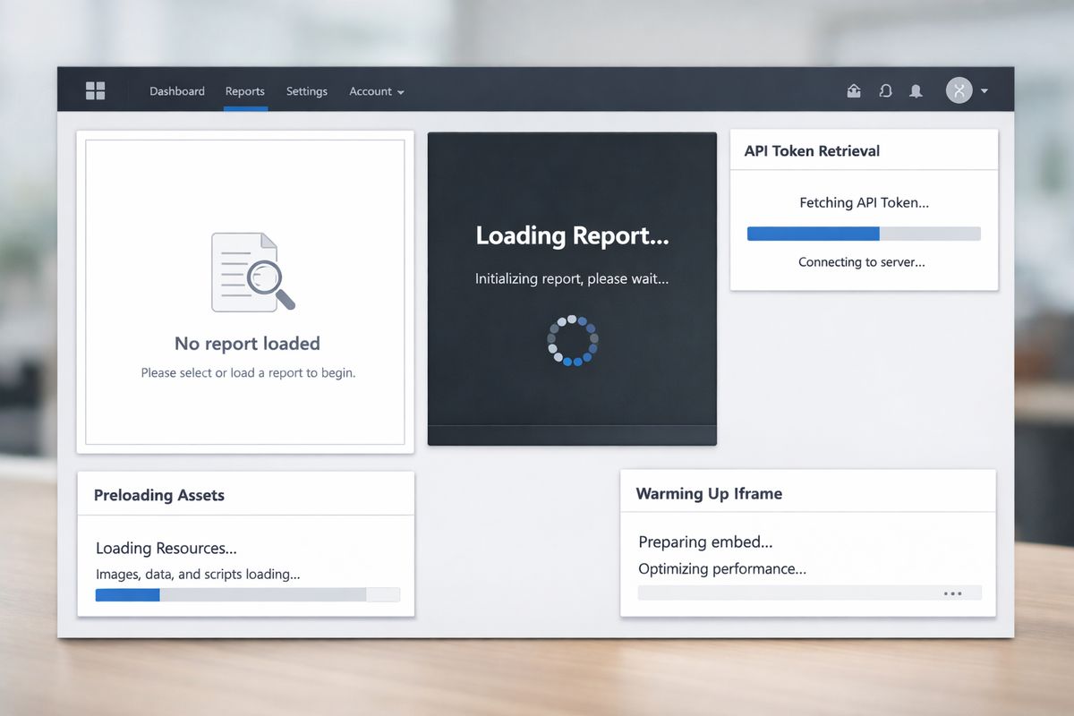
Embedding behavior is the extra layer that standard report tuning articles often skip. Script loading, token fetch timing, iframe setup, container visibility, and network chaining all shape the user’s experience. A report can be reasonably tuned and still feel sluggish if the app wraps it poorly.
Define What “Fast Enough” Looks Like
You don’t need perfection. You need a standard.
A good embedded landing page should let users understand that the report is healthy within a few seconds. If the first screen takes so long that users wonder whether they should refresh the page, that’s too slow. A slicer interaction should feel natural, not like sending a request into orbit and waiting for it to come back.
A practical rule works well: aim for first meaningful report visibility in about 3 to 5 seconds, and common interactions in roughly 1 to 2 seconds. Not every enterprise report will hit that every time, especially with complex security or huge models. But if you aren’t aiming at a number, “optimization” turns into endless guessing.
Get the Right Tools in Place Before You Optimize
Trying to tune performance without measurement is like fixing a car by kicking the tires. You need a few tools, not a giant toolkit.
For most embedded Power BI work, three places matter: Power BI Desktop diagnostics, model and DAX analysis tools, and browser-level inspection inside your app. Those together usually expose the real bottleneck.
Use Performance Analyzer to Catch Slow Visuals
Performance Analyzer in Power BI Desktop is usually the fastest first step. It shows how long each visual takes and helps you spot whether one chart, one matrix, or one interaction is dragging the whole page down. That alone can save hours.
If one visual takes 4 seconds and the rest take 400 milliseconds, the page-level fix is obvious. Sometimes the problem is a fancy table visual with too many measures. Sometimes it’s a slicer-heavy header that looks harmless but fires query after query. Performance Analyzer is built for finding that kind of issue quickly.
Use DAX Studio and Tabular Editor for Deeper Fixes
When Performance Analyzer points to a slow query, DAX Studio helps you understand why. You can inspect server timings, query plans, storage engine activity, and expensive measures. That sounds technical, because it is, but the payoff is practical. You stop guessing which measure is expensive and start seeing it.
Tabular Editor helps at the model layer. It’s useful for cleaning metadata, managing calculation logic, spotting bad naming, and keeping the model structured enough that future report changes don’t slowly wreck performance again. Microsoft also recommends keeping tools current, including Tabular Editor, because performance improvements do show up in tooling.
Check What Happens in the Browser and App
This is where embedded-specific problems show up.
Open browser dev tools and look at the network waterfall. When does the app request the embed token? When does the SDK load? When does the iframe initialize? Are you serializing steps that could run in parallel? Are fonts, scripts, or CSS delaying the report container? Is the app waiting for a route transition before even preparing the iframe?
If the report itself performs reasonably in Power BI Service but drags inside your product, the browser is often where the truth shows up.
Build a Semantic Model That Doesn’t Fight You
https://www.youtube.com/watch?v=MGkCCbK86qw
The model is the foundation. If the model is bloated, awkward, or shaped like a spreadsheet that happened to be imported into Power BI, every page pays the price.
Embedded scenarios expose this faster because outside users expect app speed. Internal analysts may tolerate a clunky report. Your customers won’t.
Favor a Star Schema Over Wide, Messy Tables
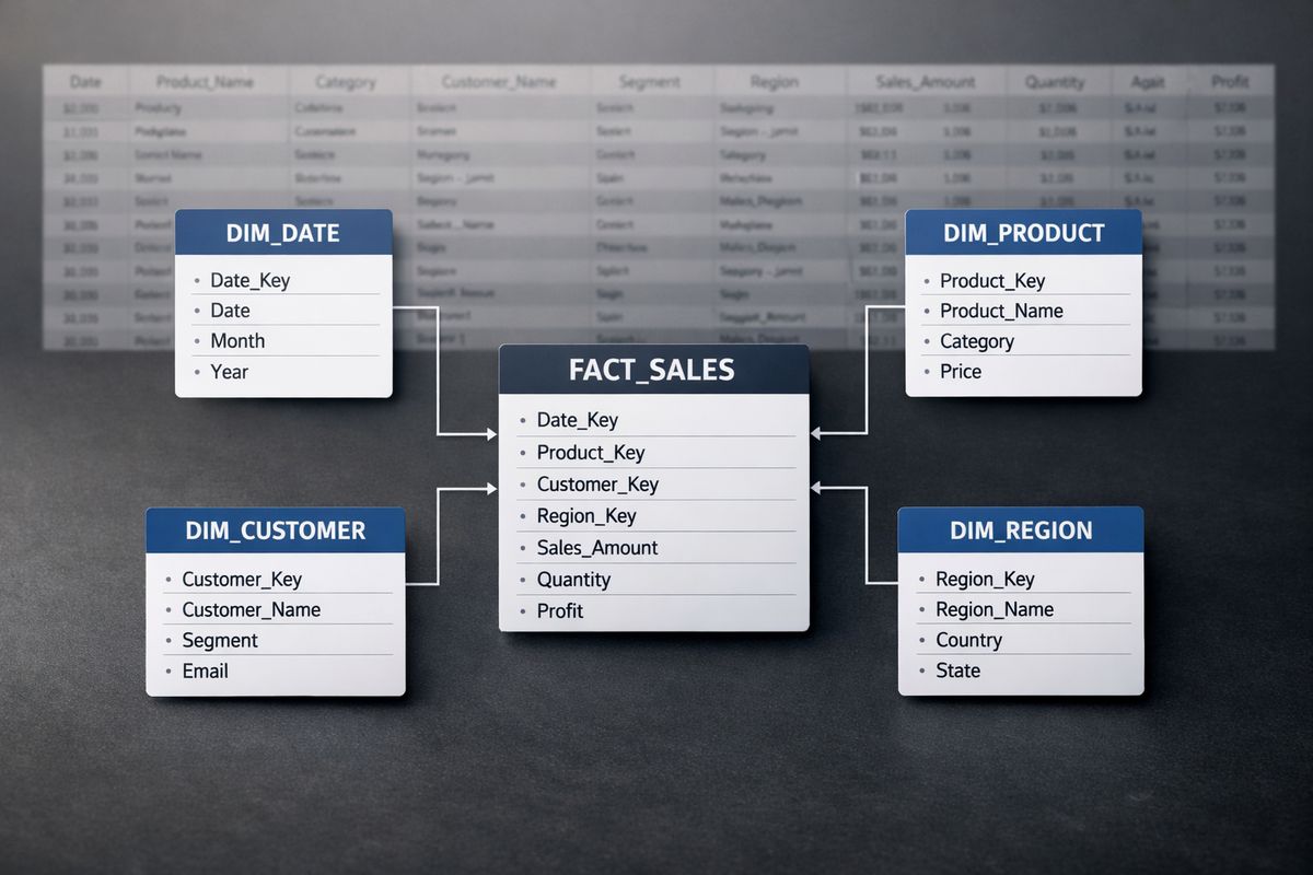
In plain English, a star schema means one central fact table for measurable events, plus smaller dimension tables for things like date, product, customer, or region. It performs well because filters flow predictably and queries don’t need to wrestle giant flat tables full of repeated text.
Wide tables feel convenient at first. Everything is in one place, until every query has to drag around dozens of columns it barely needs. Thin, long tables usually perform better than wide ones, and they’re easier to maintain too.
Snowflaking can be fine in some cases, but if your model looks like a family tree crossed with a subway map, it’s probably too complicated.
Reduce Model Size Wherever You Can
Smaller models are faster to load, faster to refresh, and easier to scale. That’s not glamorous advice, but it works.
Remove unused columns. Lower cardinality where possible. Use numeric keys instead of long text when appropriate. Avoid importing giant history windows that nobody actually analyzes. Be especially careful with text-heavy fields, because lots of unique text values chew through memory quickly.
If a dataset is large enough that full refreshes are painful, incremental refresh can change the economics dramatically. For models above 10 million rows, incremental refresh can cut processing time sharply by refreshing only changed data instead of replaying the whole history every cycle.
Hide Technical Fields and Keep Metadata Clean
Performance is not just execution time. It’s also how safely your model gets used.
Hide surrogate keys, technical join columns, and fields that shouldn’t be dragged onto report pages. Use clear names. Group related measures. Add hierarchies where they make sense. Clean metadata reduces report-author mistakes, which indirectly protects performance because fewer people build confusing visuals on top of the wrong fields.
It also makes embedded self-service scenarios much safer if users can customize or explore content.
Shape Data Early So Power BI Has Less Work to Do
Power Query and source-side shaping are where you do the boring heavy lifting once, instead of charging users for it every time a report renders. Think of it like putting groceries away before cooking dinner. If everything is still in random bags on the counter, every meal takes longer.
That’s why data shaping usually beats visual cleverness.
Push Transformations Upstream When Possible
If the source system can handle filtering, joining, grouping, or basic transformations efficiently, let it. Query folding is just Power Query’s ability to push those steps back to the source instead of processing everything locally later.
The catch is that once folding breaks, performance can drop fast. A step that seems harmless can force Power BI to pull far more data than needed and finish the work itself. That may still be acceptable for small models. It gets ugly on larger ones.
A simple habit helps: check folding often while building queries, not after the report is already slow.
Unpivot Wide Data for Better Performance and Usability
Survey-style data is a classic offender. One row, then dozens or hundreds of question columns. It looks tidy in Excel and works terribly in reporting.
A better shape is often to unpivot those columns into attribute and value rows. That creates a thinner table, which Power BI usually handles better. In fact, guidance on thin tables shows that data shape often matters more than raw row count. You may end up with more rows but a much more usable and performant model.
This pattern isn’t just for surveys. Any wide spreadsheet-style dataset deserves the same suspicion.
Choose Power Query Over DAX for Data Preparation
Use Power Query for shaping data. Use DAX for analytical logic. That line is not absolute, but it’s a good default.
If you create lots of calculated columns in DAX to clean text, split fields, map categories, or reshape source data, you’re often making the model larger than it needs to be and slowing refreshes in the process. Handle that upstream or in Power Query when possible. Save DAX for measures and calculation logic that truly belongs at query time.
Pick the Right Storage Mode for the Job
Storage mode is a strategy choice, not a checkbox.
Power BI gives you Import, DirectQuery, and Composite options. Each changes how the report behaves under load, how fresh the data can be, and where the performance burden lands.
Import Mode for Fast User Experience
Import is usually the best choice for embedded reports when speed matters. Data is loaded into the model, so interactions feel much faster than constantly reaching back to the source.
That makes Import especially useful for customer-facing portals where users expect the report to behave like the rest of your product. The tradeoff is refresh planning and memory use. If the data changes often, you need a refresh strategy that keeps pace without exhausting capacity.
Still, if your main goal is fast, smooth interaction, Import wins more often than not.
DirectQuery for Fresh Data With Extra Caution
DirectQuery makes sense when data freshness matters enough that imported snapshots won’t do. But there’s a price.
Every interaction can depend on source query speed, source concurrency, gateway health, network latency, and query folding quality. If any of those are weak, the report feels weak. Embedded apps often suffer here because users blame your app, not the database architecture behind it.
Use DirectQuery on purpose. Not by default, and not because the source is large. Large and slow is exactly where careless DirectQuery choices hurt the most.
Composite Models, Aggregations, and Hybrid Patterns
Composite models and aggregation tables give you a middle path. Keep large detail data available, but serve common summary queries from faster structures first.
This pattern is useful when most users start with overview metrics and only occasionally drill into detail. You get a quick landing experience without giving up access to the deeper records. For large datasets, using aggregation tables can make a real difference.
Tune DAX So Measures Stop Dragging Everything Down
DAX matters, just not in isolation. Once the model and report structure are reasonable, measure tuning starts to pay off more consistently.
Most slow DAX comes from a small set of habits: too much repeated logic, too much row-by-row iteration, and filters applied too broadly.
Prefer Measures Over Calculated Columns
Measures are often lighter because they calculate at query time and don’t permanently inflate the model. Calculated columns take storage, increase refresh work, and can quietly bloat large tables.
There are exceptions. Sometimes a calculated column is the right tool for stable categorization or relationship support. But if you keep adding columns to avoid writing cleaner measures, you’re paying for that decision every refresh and every load.
Avoid Expensive Iterators and Repeated Logic
Functions like SUMX and AVERAGEX can be useful, but on large tables they can get expensive fast, especially when nested or repeated across many visuals. If a simpler base aggregation will do, use it.
The same goes for repeated measure fragments. Put repeated logic in variables with VAR and RETURN so Power BI does less redundant work and your formulas stay readable. Cleaner DAX is often faster DAX.
Filter Columns, Not Whole Tables
A common performance habit is to filter the most specific column possible instead of throwing a whole table into a filter expression. Narrow filter context usually performs better because the engine has less unnecessary work to scan through.
The same cleanup mindset applies to logic structure. If you have deeply nested IF statements, a SWITCH expression may be cleaner and sometimes easier for the engine to optimize. Small improvements add up when the same measure gets hit by many visuals.
Design Report Pages for Speed, Not Just Looks
Visual clutter is one of the fastest ways to ruin performance. Embedded reports are especially unforgiving here because users expect a product screen, not an analyst’s workbench.
A page can be beautiful and still be too busy to load well.
Keep Visual Count Under Control
Every visual creates query and rendering work. That’s why keeping visuals under about a dozen is a smart default. Practical guidance often lands around under 12, and honestly, many pages should have fewer.
If the page has 16 visuals, ask which 8 actually matter on first view. Summary-first pages usually feel better and perform better. Detail can live one click deeper.
Cut Back on Slicers, Cross-Filtering, and Fancy Extras
Slicers are useful until they multiply. Synced slicers, custom visuals, tooltip-heavy pages, bookmarks, and dense cross-filtering chains all add work. Some teams keep layering on interactivity because it looks powerful in demos. In production, it often just feels heavy.
The landing page should be calm. A few purposeful interactions beat a wall of controls every time.
Use Design Patterns That Load Faster
Drill-through is a performance feature as much as a navigation feature. So are field parameters, top N filtering, small multiples, and summary landing pages. These patterns let you show less upfront while still giving access to detail.
Microsoft also recommends using more restrictive filters where possible and using drillthrough or tooltips instead of adding more visuals to the main page. That approach keeps the first screen lighter and more responsive.
Optimize the Embedding Layer in Your App
This is where many teams leave easy wins on the table.
A report can be well designed and still feel slow if your app loads the embed flow inefficiently. In embedded analytics, perceived speed matters just as much as raw query duration.
Update the Power BI JavaScript SDK and Related Tools
Outdated SDKs can miss performance improvements, compatibility fixes, and newer embedding features. Keep the Power BI JavaScript SDK current. Keep Power BI Desktop current too. The same goes for supporting model tools.
This sounds boring because it is. It still matters.
Use powerbi.preload() to Warm Things Up
If the report is not shown immediately, preload assets before the user reaches the report screen. Microsoft recommends powerbi.preload() because it caches JavaScript, CSS, and related items before embedding starts.
That doesn’t magically fix a bad report, but it cuts dead waiting time users feel in the app. And perceived speed counts.
Use powerbi.bootstrap() Before You Have the Final Token
Bootstrapping is one of the best embedded-specific quick wins. Instead of waiting for every backend call to finish before preparing the iframe, you can initialize the container early and let setup happen in parallel.
Microsoft’s powerbi.bootstrap() guidance exists for exactly this reason. It helps remove the slow, sequential setup pattern that makes apps feel laggy for no good reason.
Get Embed URLs From Microsoft APIs and Handle the Container Correctly
Use embed URLs returned by Microsoft APIs instead of hand-building them. That avoids subtle mistakes and supports performance-related configuration behavior in the URL.
Also, keep the embed container in the DOM. Don’t hide it with display: none before initialization. If you need it invisible, use visibility: hidden instead. It sounds like a small detail. It can save you from weird initialization delays and rendering issues.
Watch the Environment: Capacity, Gateway, and Network
Once usage grows, the environment starts showing its teeth. A report that feels fine in development can buckle once real traffic arrives.
That’s why testing with one developer at 9:00 a.m. proves almost nothing.
Capacity Sizing and Concurrency for Embedded Workloads
Embedded workloads are bursty. A customer portal might be quiet at 8:55 and slammed at 9:00 when everyone logs in. Capacity has to handle concurrency, not just average usage.
Plan around actual usage patterns. A realistic pilot is much more useful than guesswork, and realistic usage patterns are the right basis for scaling decisions. If performance tuning starts only after broad rollout, you’re already late.
Gateway and Source Connectivity
Gateways and source connections add friction, especially for DirectQuery and hybrid models. Slow on-premises connections, overloaded gateways, and distant source systems can all stack up.
Picture a report tested on a laptop in Seattle that feels decent at 7:30 a.m., then opened by customers across the country during a Monday morning rush. Same report, very different path. That’s when hidden bottlenecks show up.
Network Latency and Regional Placement
Geography matters. Power BI, data sources, gateways, and users all live somewhere, and distance adds time to every request.
Microsoft recommends keeping these pieces as close together as practical, ideally in the same region, because network latency directly slows report interactions. In embedded apps, where the report is only one part of a broader page load, chained latency hurts even more.
Monitor Performance After Launch So It Stays Fast
Performance work is not a one-time cleanup. Reports drift. New measures get added. Pages gain visuals. Source queries change. What was fast in March can feel sticky by July.
You want to catch that before users start sending screenshots of frozen spinners.
Track Real Usage in Production
Watch page load times, visual render times, refresh success, failed loads, popular pages, heavy filters, and peak traffic windows. Production behavior tells you which reports deserve attention, which pages are overloaded, and where concurrency starts hurting.
This matters more in embedded products because performance shapes trust. If users hesitate before clicking because they expect a wait, that’s already damage.
Set Team Standards for Reports and Models
A little governance saves a lot of cleanup later. Set naming conventions, visual count limits, model review checks, and approved design patterns. Keep a short checklist for new reports so obvious performance mistakes don’t keep coming back.
Even metadata discipline helps. Consistent naming improves maintainability, and cleaner structure makes future optimization much easier than digging through a report built like a junk drawer.
Quick Wins You Can Try This Week
You don’t need a full rebuild to get a noticeable improvement. A few focused changes often make the slowest page feel much better.
Five Fast Fixes With the Biggest Payoff
Start with the obvious. Trim unused columns from the model. Cut the visual count on the slowest page. Replace one or two expensive iterator-heavy measures. Enable preload and bootstrap in the app. Check whether query folding broke in a major Power Query step.
Those changes don’t require a grand redesign, and they often produce visible results quickly. If a page has too many visuals, reducing that count alone can change the experience more than a day of minor DAX edits.
When to Rebuild Instead of Patch
Sometimes the report is slow because the whole structure is fighting you. Huge wide tables, tangled relationships, DirectQuery on a struggling source, and pages stuffed with visuals are signs that patching may not be enough.
When that happens, stop polishing the surface and rethink the model, storage mode, and page design together. But before you jump into a full rebuild, try one thing first: remove half the visuals from your slowest page and measure the difference. That single test tells you a lot, and it’s often the fastest way to prove what actually matters.